
How many times has it happened that you had the perfect sales pitch or landing page, but with no leads to brag about? Thousands of visits on your landing page vs. zero conversions and a high bounce rate. You spend hours of your time, trying to find the answer to the riddle as to why this happened. And the answer is simple – your Call to Action (CTA) simply wasn’t persuasive enough to close the deal. Unfortunately, this is a dominant issue in digital marketing – that last push to ensure that a website visitor converts into a client.
Wouldn’t it be great if you had a simple yet detailed guide on how to create high-converting CTAs in, let’s say, 15 steps?
Well, here it is! 15 tips on how to create high-converting CTAs:
Finding the perfect combination of elements and putting it all into a single Call to Action might seem simple, but it is far from it. This is one of those game-changing details that can determine whether or not your marketing campaign will succeed.
- Are you familiar with your target base?
- Do you understand your clients?
- Which colours should you use?
- Which combination of words drives people to take action today?
These are all questions that you need to be able to answer before you hope to create high-converting CTAs for your marketing efforts. It is my hope that you will be able to do just that, after these 15 steps.
1: Choose the right colour for your CTAs
Colour can speak volumes to your clients, no matter how small the section or button. This is why you should take the time to consider the colour you want your CTA in. Make it easy on yourself with this quick colour-choice checklist – it needs to:
- Be a colour.
- Stand out from the background.
- Not clash with the background.
- Grab your attention.
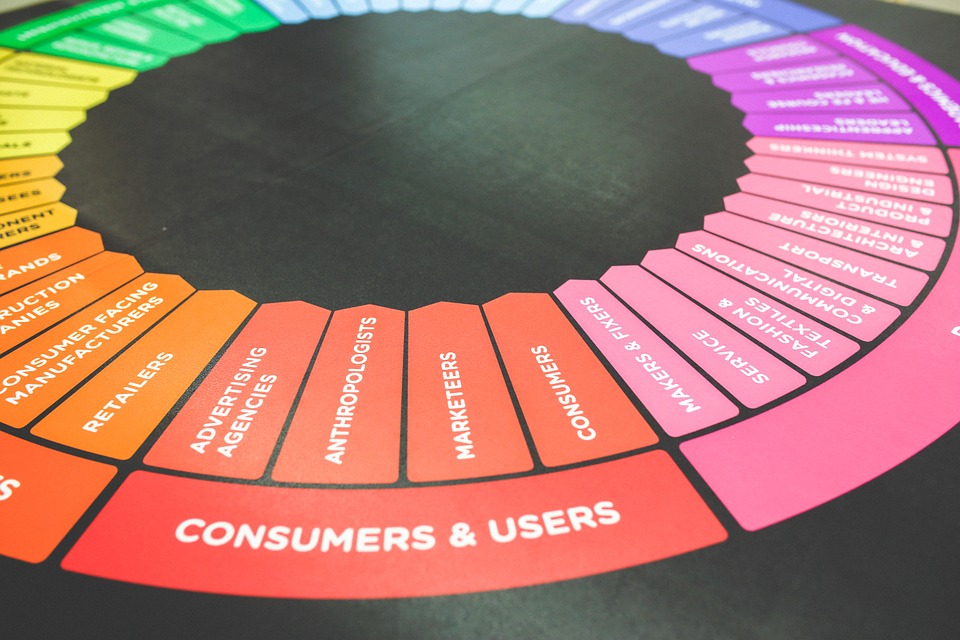
Colour plays an important role in CTAs.
One way to test this it to try with your company colours first, and then do a trial run with other colours. This way, you will be able to determine which colour works best for your niche.
2: Don’t over-complicate the design
Yes, if you want to create high-converting CTAs, they should stand out. However, this doesn’t mean that you should go to Las Vegas with your design. Sometimes, less is more, and the same can be said for a good call to action. Keep font colour limited to black or white, while changing the background colour of the button.
3: Size does matter – keep it sensible
Despite what people might have you believe, bigger is not always better. With CTAs, you have to make sure that the button is sensibly sized. Here, you need to consider both desktop and mobile device users. If a button is too, small, people might have a hard time clicking on it. And if you make the button too big, mobile device users will find it overwhelming and annoying. So, balance is key here.
You have to consider mobile devices and how your CTAs will fit in there.
4: Choices are always good to have, as long as you limit them
People love to think they are in control. This is why we love having choices when faced with a decision to buy something. However, you can’t give people too much space for thinking and establishing control. So, if you do decide to give people a choice between different CTAs, limit it to a maximum of 2 choices.
To create high-converting CTAs, you have to limit your options.
5: Make sure the design is inviting and clickable
As obvious as it is, people need to know that the CTA is clickable. What this means for the buttons is that they should have:
- A rectangular shape
- Clear boundaries or borders
- White space surrounding them.
- A contrasting colour
By following these criteria, you will make the buttons more clickable. Combine that with action words and you get the result you’re looking for.
6: Create high-converting CTAs in such a way that they are the next logical step
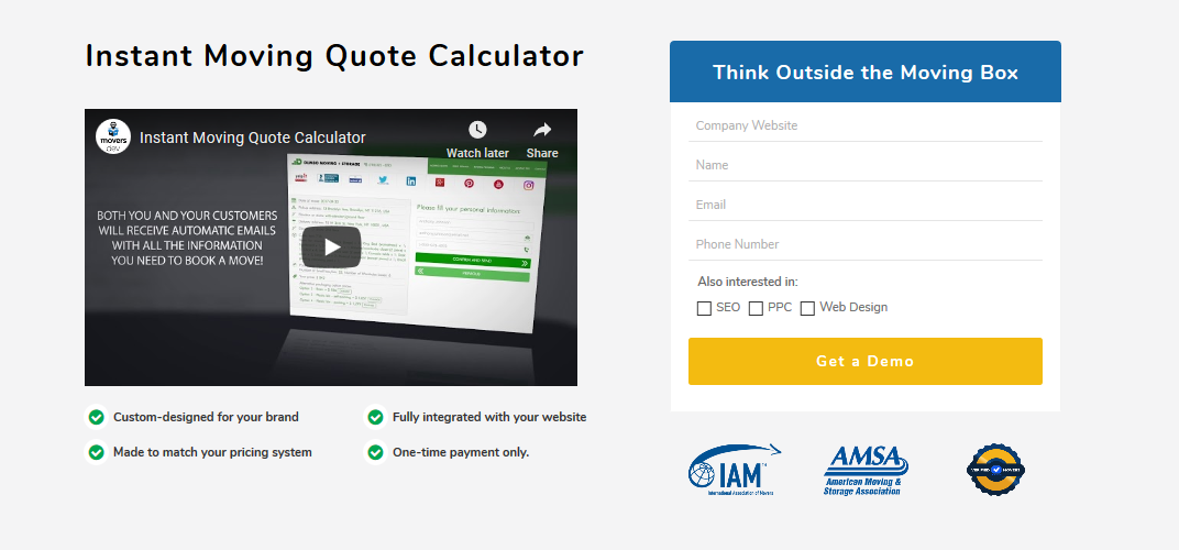
“Okay, now I need to click on the button and proceed”. This should be the thought that comes to the mind of online visitors once they reach the call to action. That button should be the final, and culminating part of the process. You can usually find examples like these when you have a company that is presenting a product. In the image below, Movers Development presents a moving quote calculator through a video. They then ask potential clients to apply for a demonstration of the product right next to it, in plain view – the next logical step.
Always have everything in plain sight when you aim to create high-converting CTAs.
7: Quality of wording over quantity
When you aim to create high-converting CTAs, you need to focus on maximum impact with minimal wording. The button has to be a knockout that will be direct and to-the-point. Glance-click-done.
8: Aim to make an impact
The Call to Action button is one of the most important page elements. This is why the content has to be nothing short of perfect. However, this varies from campaign to campaign and company to company. So, there are several tactics that you can combine:
- Use action words (get, try, use, read, see etc.)
- Use timing words (today, now, ASAP etc.) to create high-converting CTAs
- Keep it positive – including positive encouragement.
- Stick to obvious nouns (checkout, course, deal etc.)
- Spice it up with value – using “free” or “no charge” etc.
- Keep it consistent – always think about what you’re offering.
9: Focus on first-person CTAs to generate conversions
Speaking to the needs of your clients is one of the best things you can do when calling them to take action. Rather than using “we” or “our” and drawing their focus away, target it with 1st person CTAs – “my” or “I” etc.
10: Apply pressure with a sense of urgency
We all know that if given too many options and space to think, people tend to prolong making a decision. This is why you have to implement that sense of “limited time” urgency into your CTAs. Today, you have to push clients in the right direction to get the desired effect.
11: Explore the aspect of “lazy” CTAs
Not everyone is willing to take a short time and little effort it takes to get through your perfect landing page and click to proceed. However, this is where “lazy” CTAs can come in handy. Usually, you would use these when asking for credit card or address information, to make it as simple as possible for people to proceed to the next step.
This might be too demanding for people looking for a quick fix.

12: Make the white space work for you
The International Design Foundation claims that “Macro white space” acts as a container for your design, and can be incredibly calming to your user. So, why not use this to your advantage. Leaving adequate white space around your Call to Action button sends a clear message to visitors. However, this does not necessarily need to be limited to white space – sometimes a non-intrusive photo can fill the role of “white background space” and focus people on the CTA.
13: High-converting CTAs should be optimized location-wise
Just like all the elements we mentioned up to this point, the location of the CTA plays a key role as well. You have the popular opinion that the solution to create high-converting CTAs is to put it at the end. However, according to research done by Hubspot, only 6% of conversions come from CTAs at the ends of posts. So, you have to carefully consider where you position your CTAs.
14: Keep it specific for effect
People today are used to seeing ads and marketing campaigns. So, offering them products or services through universal terminology won’t make an impact. The more specific you are in what you’re offering, the easier it will be to create high-converting CTAs. One idea is to personalize deals or promotions with number or brand names etc.
15: Be prepared to get into some A/B testing
At the end of the day, none of the previous 14 steps we mentioned will matter unless you test and measure the results. Testing is that constant factor that plays a crucial role in finding your perfect and high-converting CTAs. So, test, test, and then test again. It might take time, but you will get there eventually. And once you do, it will only be a matter of putting it all together.


